Google has started to roll out the new Gmail layout for some users, only to face backlash. As per reviews on social media, it didn’t seem they were ready for this unwanted change to something they regularly use. The tech giant announced in June that it was going to release an “integrated view” for Gmail, raising eyebrows. It has made changes to the Gmail UI multiple times in the recent past, which has become annoying for many. As soon as they adjust to the change, Google drops in a new update, leading to imminent criticism. Before jumping into what users think about the new update, here’s a brief look at everything that has changed.
All Changes in New Gmail Layout
In essence, the company has redesigned the sidebar and changed the font from Roboto to Google Sans Text in the new Gmail layout. The update aimed to make the popular mail application more personal and customizable with the help of Material 3 design. The sidebar will now serve as the main menu for all applications, removing the previous drop-down menus. There is also a collapsable panel containing app-specific details. The main sidebar provides access to Mail, Chat, Spaces, and Meet, while the collapsable panel shows Compose, Inbox, Drafts, Sent, Trash, etc. Each label is now followed by an icon.
The main menu now has a hover function, allowing users to navigate between apps with pace. The collapsable menu can be retracted by clicking the hamburger icon to give the right pane more space. However, collapsing the inner panel also hides the Compose button, which can also be accessed by hovering over the Mail icon in the main sidebar. This was annoying for many users, who would prefer to have Compose button visible at all times.
One small change to the search function might be a bit useful. Now users can apply filters to their query before searching their inbox for a specific mail.
User Reviews
The New Gmail layout received a mixed response from users. A very few seemed excited on social media about its customization options, while others were not so thrilled. A common review was disappointment at “unnecessary” change. Many felt that there was no need to touch the UI for any reason. Some complained about the text being harder to read due to the addition of so many icons. They preferred the tech giant to reduce existing clutter on the screen instead of adding more. Additionally, the different shades of blue colour were also distracting the users. It is not clear immediately which button is highlighted and which is stagnant.
Developers also noted some inconsistencies in the UI design. The size of the items on the screen and rounded corners were also not designed proportionally. For a company as big as Google, the latest change came off as rather amateur. Many hoped that Google would fix these issues soon.
How to Revert to Classic Mode?
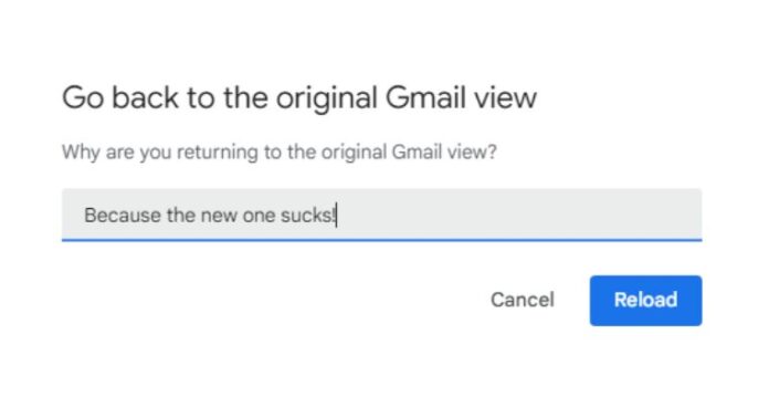
While waiting for Google to make some tweaks to its latest update, many wish to get the older version back. Luckily, Google has provided an option to switch to the classic version for those who do not like the new Gmail layout. Users can click on the gear icon in the upper-right corner, which will pop up a Quick Settings menu. If the user is already on the latest view, he/she will see a small portion saying “You’re using the new Gmail view” with a link to “go back to the original view”. Clicking that will restore the older version without the new sidebar. On the way back to the previous version, Google will ask about the reason for switching. Users can either input their opinion or just click Reload to skip the small talk.
Also Read
Google Chrome Has Introduced Tab Group Feature for Its Beta Version


